Digital Influx is an EdTech startup focused on educating kids and adults about UX Design through their E-learning platform, courses and bootcamps.
My Role
User Researcher and UI Designer

Duration
January 2024 – April 2024

Digital Influx Foundation Website
This project aimed to improve the company's current website by creating a new, separate foundation platform focused on educating people about the company’s vision and mission to provide quality educational resources to underprivileged children, and gather donations.

Current Mission
To provide quality educational resources to underprivileged children. Recognising the growing demand for UX designers, Digital Influx decided to launch a project that focuses on raising funds to help children develop skills in this field. The aim of this project was to create a new website that could effectively attract donations, engage donors, and highlight the impact of their contributions.
Problem
The existing Digital Influx website had several issues when it came to the donation section, including poor navigation, and low user engagement. Users struggled to find information about the company quickly and experienced difficulties contacting the company with queries about donations and support. These problems resulted in high bounce rates, decreased user satisfaction, reduced donations, and low overall engagement.
Project Goals

1. Attract Donations: Develop an easy to navigate platform that encourages individuals and organisations to donate.
2. Engage and Retain Donors: Create features that keep donors informed and engaged.
3. Increase Transparency: Ensure donors can see how their contributions are being used.
4. Update the overall design:
Create a more visually appealing and easy to use platform.
We aimed to reduce bounce rates, increase user engagement and boost donations and awareness.
Target Audience
General Public, Tech and Design professionals, Charity Organisations, Educators, Non-Profit Groups
Market and User Research
We conducted extensive market research to understand the preferences and behaviours of potential donors. This involved:
Interviewing potential donors to identify key motivators and pain points.
Interviewing educators and UX professionals to understand the educational needs of children in UX design.
Competitor Analysis: Analysing similar donation platforms, to see whats working.
What we heard
We conducted surveys with 30 participants and interviewed 5 professionals to understand their key motivators and pain points.

''I would like to see regular updates on the progress of the children, including their projects and achievements. A section for success stories and the impact of donations would be motivating.''
''Yes, I have donated to causes online before, such as GoFundMe and educational programs. My experiences have been mostly positive, although I sometimes worry about how the funds are being used.''
''I have used other platforms before but found them difficult to navigate. The donation process was confusing, and the overall design felt cluttered. It was hard to find the information I was looking for.''
''I think more information about the long-term impact of donations and success stories would be beneficial. Also, a breakdown of how donations are used.''
Some key insights included:
Users worried about where there money was going due to a lack of information.
Confusing donation processes made them less motivated to make donations.
They wanted to see the long term inpact of their donations.
Meet Nicole

Whats been working on the market
We continued with our market research and analysed 5 similar donation platforms, noting industry standards for design, functionality, and user engagement techniques.
Each donation platform featured clearly visible and easy to locate CTA buttons on the landing page, making it easy to donate.
The organisations purpose was clearly conveyed through sections outlining the company's mission and values. Allowing users to immediately understand what the platform was about.
Prominent use of whitespace, and a clean interface, is crucial in making the website highly functional and user friendly.
Incorporating elements that foster trust and transparency, such as success stories and regular updates, is essential.
Key indicator of how many people have already donated gives the users a more friendly and trusting experience.
The option to either volunteer or donate, based on individual preference, proved to be very popular among users on these platforms.
Ideation and Strategy
Our team brainstormed to conduct a SWOT analysis and a card-sorting activity.
This helped us identify the strengths, weaknesses, opportunities, and threats of the project.
Through card sorting, we organised and prioritised various elements to determine the essential components needed for the platform before moving on to the design stage.


Our approach to simplifying and enhancing user experience of the website

Simplicity
Create a simple and consistent user journey thoughtout the platform, and make the ability to make donations easier with the use of clear CTAs and fields.
Trust & Transparency
Ensure trust and transparcey in the donation process by adding extra security and student success stories so users know how their donations are being used.
Condensed Navigation
Simplify the navigation bar with key sections and easy to navigate CTAs.
Responsive design
Ensure the design is responsive over multiple platforms for ease of use.
Clarity
Create a clear section on what the company is about and an
about page that includes the mission, impact, story, vision, and the team.
Feasible
Work within constraints of the existing platform.
MID-FID
WIREFRAMES
Developed Mid-fidelity wireframes for the main pages, including the homepage, about us, contact us and donation pages.
Usability tested with users and validated these wireframes through stakeholder reviews.
Landing page

Contact Us

Make a donation


A/B tested two potential donate page designs with stakeholders during weekly review and users to see which one met business and user requirements.
Created high-fidelity using Figma, which were usability tested with users. We then iterated on the designs based on user feedback.
Clearer and more informative donation page
New donation request form page

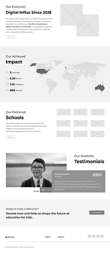
Current donation request form page

Decluttered and concise navigation bar
New

New navigation bar is consiser making it easier to use and consume. This tested well with users during user research.
Old

Crowded and confusing navigation bar
Informative homepage with new look
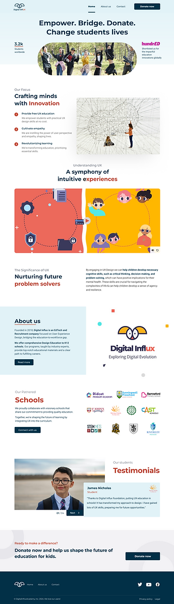
Key metrics of how many students we sponser worldwide.
Clarity on our vision and focus.
Who we are as a company and what we do.
Student success stories for increased trust and transparency.
More organised and easier way to contact
New

Old


Design System
Updated and enhanced company’s current design system to align with the changes we made in the new platform. Kept consistency with the typography, colour schemes, icons, and UI components to ensure a organised look and feel.

