A Platform To Prevent & Help People Overcome Homelessness
UX/UI Design | 2 Weeks Timeline | Conceptual Project


Friendly reminder: The main points are highlighted for your convenience and better user experience :)
MY ROLE
UI designer and UX researcher.
THE PROBLEM
People suffering from homelessness due to changes in their current circumstances have a difficult time trying to find what support is accessible to them and what they can do to avoid becoming homeless.
'Reports state that more than half of those people (58%) did not receive any meaningful support.’
(https://sustainuk.org/2018/07/30/lack-support-homeless)
MY HYPOTHESIS
Create a platform that will help homeless people find shelter, employment opportunities, meals and all-rounded support that is easily accessible, to help them find solutions to their problems.
‘People want all-rounded support when it comes to their health, housing, and employment all in one place.’
(https://sustainuk.org/2018/07/30/lack-support-homeless/)
THE SOLUTION
A mobile application with easily accessible resources in one place.
BACKGROUND RESEARCH
Past studies showed that there are raised concerns happening across local councils and their support systems for those facing homelessness.
Reports stated 58% of people did not receive any meaningful support.
(https://sustainuk.org/2018/07/30/lack-support-homeless/)
I began to draw out from various articles, websites and studies on why people become homeless, what support they receive and how homelessness has changed over the years.
A few of the leading causes of homelessness are...
-
lack of affordable housing
-
poverty
-
unemployment
People are also forced into homelessness when they leave prison, care, or the army with no home to go to at their most vulnerable, due to the lack of support out there.
(https://www.crisis.org.uk/ending-homelessness/about-homelessness/)
1
Section to easily find shelter or a room.
-
Simple steps to find shelter or a room to avoid confusion.
-
A clear indication of what is available to save time.
-
All information is stored on the app.
-
Have a place to stay somewhere warm and off the streets.


2
Map to locate what services are near you.
-
Map to show what's near you and what's available.
-
Find a meal by clicking on a pin.
-
Shows how many meals are left and you can directly reserve a meal in the app.
3

Book appointments for jobs or help.
-
Book, Track and Manage all your interviews and appointments at glance.
-
Instant scheduling.
-
All are available in your messages.
RESEARCH FINDINGS
Although there is help available out there from charities, and local councils, there are many reasons why people do not/cannot use these services.
Some reasons were...
-
Difficulty accessing them:
People cannot access them in the first place as they do not have an address, or proper identification, to book appointments.
-
Difficulty registering at the GP:
GP surgeries do not allow people to register without an address, even though this is not a legal requirement. This dramatically affects homeless people who require medical advice or healthcare.
-
Difficulty getting all-rounded support:
People feel medical professionals do not usually understand their circumstances, so they don’t get the support they need.
-
No set location:
As homeless people do not have a set location or access to what's near them they miss out on services, for example, free meals from shelters due to the lack of knowledge of what's around them.
COMPETITOR ANALYSIS
The competitors showed a lot of inconsistencies within the applications and a lack of in-depth services which would make it difficult for them to have long-term benefits.
I conducted a competitor analysis of 4 homelessness applications on the market that are the closest competitors to the product I am planning to create.
I did this in order to determine what has already been done and to see what worked and what was lacking.

Competitors
Key Features
COMPETITOR ANALYSIS INSIGHTS
Only Centrepoint and Beam offered help with employment, housing, and a general help/advice section.
All the apps had desktop versions, Street link also had a mobile application.
Only Next Meal offered people a place to find food.
Only Beam offered a section on money help and how to save.
EMPATHISE
EMPATHISE
USER INTERVIEWS
The current services out there are not useful enough for homeless people.
Due to the sensitivity surrounding homelessness and accessibility issues, collecting user data from interviews or surveys was quite difficult.
I was able to overcome this problem by finding several previously conducted focus group interviews and surveys online.
(https://www.ncbi.nlm.nih.gov/pmc/articles/PMC8744897/)
USER INTERVIEWS INSIGHTS
People without a permanent address get turned away from shelters or cannot register with a GP as they can't prove their homeless status.
‘I couldn’t register with a GP until I had a permanent address.’
People were treated with prejudice by health services when it came to their addiction problems and weren’t guaranteed the service that they needed.
‘I feel like I’m being judged by them, even before I say anything…’
Although there is support these services are not signposted well enough and due to the lack of knowledge people have, they do not get to make use of these services.
‘It’s there, but unless you know where things are, it’s kinda pointless.’
People emphasized the need to be able to access any basic information and online services that will help them with their questions and issues.
‘We need information on jobs, and more information on chemist opening times for prescriptions.’
RED ROUTE ANALYSIS
A red route analysis helped me to identify what features users would consider the most to least important when using an application created to help homelessness.
I used 10 users to help me do this task. I ensured to let them know all the possible features I deemed important from my previous research to ensure the analysis is as accurate as possible.

RED ROUTE FINDINGS
Key features people deemed important...
1
2
3
4
Finding shelter or a place to stay.
Employment help/advice to get a job.
A section to find food available.
Map locator to see what services are near them instantly.
USER PERSONA

THE MAIN INSIGHT
From pain points to solutions
Before moving onto the ideation stage, I pulled out a few pain points from my research and then mapped out how I would solve them...

DESIGNING, TESTING & REPEATING
DESIGNING, TESTING & REPEATING
IDEATION PHASE: MINDMAPPING
Mind mapping allowed me to have a visual representation of how my design will function. This was a useful way for me to put all my ideas and thoughts out there figuring out what may or may not work.

CRAZY 8'S
The Crazy 8’s allowed me to freely sketch out any design ideas that popped into my head. I was able to design spontaneously without any restrictions or constraints.
I tested them with 5 users to see what they liked and what they did not. I then took any feedback I received forward and began starting the design stage of my project.
👍🏽 4 👎🏽 1

👍🏽 2 👎🏽 3

👍🏽 0 👎🏽 5

👍🏽 3 👎🏽 2


👍🏽 3 👎🏽 2
👍🏽 1 👎🏽 4

👍🏽 3 👎🏽 2

👍🏽 4 👎🏽 1
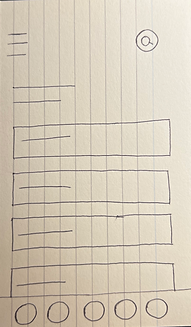
STARTING THE UI: SKETCHING

Feedback + Users pain points
Pain point: Resources are complicated and cluttered, wants an easy way to find what is available.
Solution: Divide the resources into groups using headings for a less cluttered and cleaner interface.
Pain point: Icons are confusing and complicated
Solution: Clearly labelling the icons and limiting them to 4 instead of 5
Pain point: Too many steps to take when enquiring about a service.
Solution: Make the user experience better by shortening the journey.


Pictured are early sketching iterations of my initial ideas.

Pain point: Too much information on the screen
Solution: Decrease the information and make the section more concise
MID FID WIREFRAMES
I then gathered feedback on my design from users so I could later iterate the design and ensure it solved the initial problem.
I took two of the most popular sketches from my crazy 8’s ideations and created wireframes. I then asked for users' feedback to see which design they felt was more useable and what I should change.
Home screen 1


Home screen 2
Users stated that they liked how screen 2 showed resources instantly instead of personal resources such as messages. They felt there was more convenience in this.
Users liked home screen one better than two as they felt it was cleaner and less complex.
Users expressed that the menu bar has too many options which need to be cut down as it makes the interface appear overwhelming.

There should be an easier way to view the map for people to find services around them quicker.
Add an audio speech button to the search bar to help people with disabilities.


This section should be condensed as booking or enquiring about a service should be a smooth process.
TESTING + IMPROVEMENTS
Feedback and improvements to my designs.
I then took the feedback I gathered forward, and iterated my initial wireframes.

-
Changed the home screen to services and resources homeless people are looking for. This will allow them to find what they’re looking for faster.
-
Added 4 key icons to the menu bar instead of 5.

-
Added an audio speech button to the search bar to help people with disabilities.

-
Made the enquire section more condensed with relevant information.
-
Added button to view entire map to set locations or see all services available in the area.
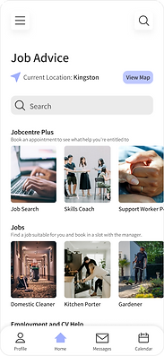
THE FINAL UI

Finding shelter or a place to stay:

Finding a job or in need of job seekers help:

Booking an appointment i.e. with a careers coach:

Finding a meal with the use of map services for a better user experience:
TESTING + FEEDBACK
Feedback received on the flow and user experience:
-
‘The design is clean however there was no way to go back from the job search screen to the homepage.’
-
‘I like the look of the screens but sometimes I just want to see what services are around me faster, there should be a way to access the map quickly and directly from the home screen.’
PROTOTYPE
Taking in the feedback and then prototyping...
I then took the feedback I received and created prototyped screens which showed improvements in the concerns users expressed.


Created in Figma
Test the prototype yourself
TESTING + FEEDBACK OF THE FINAL DESIGN
Feedback received:
-
‘Simple design that’s easy to use and navigate, with resources in one place.’
-
‘Booking an appointment is quick and simple, the use of the colour green for confirmation makes the UI more accessible.’
-
‘I like the map feature and colour coordination; it makes it simpler to find what you’re looking for.’
Improvements to consider:
-
‘Too many options on the homepage shown at once can be a little overwhelming.’
-
‘Sometimes there are steps during a process which do not need to be taken.’
-
'Double search buttons may get confusing for users.'
STYLE GUIDE


EVALUATE
EVALUATE
DESIGN FUNDAMENTALS & THE LAWS OF UX/UI
UX/UI design laws were used throughout my design process to ensure my design is useable and functional.
Millers Law: Organising content into smaller chunks.
Resources are split up and put into groups which are easier for people to consume.
Carousell for resources, however, only 3 are shown at a time on the screen to avoid overwhelming the user.
Aesthetic Usability Effect: Perceiving aesthetically pleasing design as design that’s more usable.


Use of colour and boxes which coordinates with each different section.
The colours are used as a key which is also shown in the map feature.
This makes it easier for the user to navigate through the app and locate what they’re looking for faster.
Clean and consistent design and apparent use of negative space.
Law of Common Region: Grouping common sections together, with clearly defined boundaries.
Key sections on the home page are placed into their own colour coordinated clickable boxes. Easy for the user to locate and access.

Each specific section is grouped with clear headings and individual clickable boxes.
Law of Similarity: Visually similar Elements will be perceived as related.

Ensured links or buttons are visually different from normal text by making buttons larger with arrow icons and of different colours.
Also made sure any clickable link is bold and underlined so the user knows it is clickable.
Hicks Law: Less complexity means choices are made quicker. Achievable through a clean interface with fewer stimuli.
The home page is clean and concise with minimal information.
Each section is boxed and clearly labelled.
-
Initially wanted to add images to this page however, after user testing got rid of this idea to prevent confusing/overstimulating the users.
Simple and clearly labelled choices give the user a better experience.
Also, the use of white space for a less cluttered interface.
Simple navigation bar with only 4 key icon buttons.
WCAG & INCLUSIVITY + ACCESSIBLE DESIGN
It is important to create a design that is useable, accessible, and inclusive to all these individuals.
There are several disabled individuals who are homeless and increasing, but also many homeless people have not had access to technology over the years and therefore may not be as tech-savvy.
This meant creating a design which took into consideration people with problems with hearing difficulties, sight issues and more.
-
When it came to typography, I ensured all font sizes were 14px up, apart from small labels, such as the navigation bar being 12px, however, icons were clearly visible to help.
-
I also made sure all button sizes and search bars met the minimum touch area requirements by creating these buttons and then getting users to test them out using the ‘Figma Mirror’ application. I did this to make sure they were easy to use, tap on, and access.
-
Any error was clearly outlined in red, such as an incorrect input within the search bar, this allows the user to quickly understand that there is a problem which needs to be resolved.
-
I also tried to keep my design as clean and concise as possible, making use of white space, to avoid overwhelming the user.
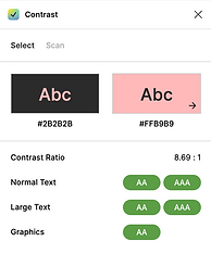
COLOUR CONTRAST
When it came to colours used within my design, I made sure they also met all accessibility standards so people with visual impairments would not have any issues.
I tested out this by using Figma's built-in colour contrast checker. I made use of each colour used to meet either AA or AAA standards, if they did not, I reiterated my designs, and made sure they would.


CONCLUSION
LOOKING BACK AND MOVING FORWARD...
In conclusion, this project was highly enjoyable, the feeling of being able to step out of my comfort zone and design an application which would benefit and help a minority group of individuals was highly gratifying.
Carrying forward I will...
1. Conduct more user research/testing. As this project was based on the sensitive topic of homelessness as well as it only being a 2-week sprint, it was difficult for me to collect corroborated research directly from homeless people. Because of this, I found I had to design my application accurately. Next time I hope to spend more time conducting user research to ensure I can create an app that is highly authentic for the users.
2. Iterate and test my design more. I noticed due to time restraints I was not able to test and iterate my design as much as I should have. Testing is crucial when it comes to UX/UI as it allows you to fix any issues that users come across earlier on during the process. Next time I will test earlier on so I can solve any issues users face.
3. Validate my hypothesis. If I had more time I would take extra steps to validate my hypothesis by testing out my final design with the homeless community to see what works and what can be improved.